Installation art may be the only type that lets artists actually live up to their outsider, free-spirit, totally bullshit reputation. It’s also more fun for the audience to get to step into/touch/eat the artwork, so they tend to be crowd pleasers and museum favorites.
I’m inclined to give artists more credit for giant installations because A) they’re distinctly unsellable and B) they leave little room for repeat or rehash. If someone tries to do the same thing a second time, he or she will get called out on it. (Unless you’re Damien Hirst — a big fuck-you to him and the Tate Modern, by the way.) In this sense (and only in this sense), installation work can be viewed more as art-for-art’s-sake, even if we acknowledge that this phrase needs to be retired and shot. There is art for expression and entertainment and social change and money. That’s about it.
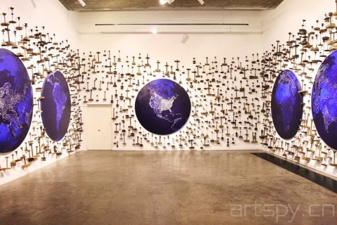
Bai Yiluo’s “Illuminations” (above) is the product of two years of work in which he “tries to stress the feeling of being observed from afar.” Not to sound snide, but something like that is too easy to dismiss. Why would surrounding a person with lamps rusted to the point of being indistinguishable inspire any feeling?
I suppose it’s intended to make me feel overwhelmed? There is an immediate claustrophobic perceptual excess, not unlike walking into an antique shop too small for its wares. The moribund lanterns do evoke eyes and vision in a Tower of Sauron kind of way, and serve as a conceptual juxtaposition with the paintings and the fabricated illumination that now defines life on earth. Perhaps I’m jaded or an ass or whatever, but I don’t really think it’s useful for me to stand in awe of the amount of electricity we produce. It’s just not that compelling of an idea. Bai is trying to get the viewer to step out of his limited perspective and contemplate the world on a macro scale. But aside from oohs and aahs, what else does he want us to think about our technological advances? There are a lot of profound and terrifying things to say about how we now live and how little we understand its implications, but Bai doesn’t really say any of them. “Raising awareness” is not an admirable goal in itself, it’s just lazy and self-satisfying. That goes for you KONY people, too.
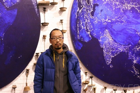
The paintings themselves are very beautiful, electric macro-nightscapes of that sort of gauzy lapis lazuli blue under shimmering silver dots. If he stuck with just these I think I’d like the exhibition a lot more. Of course, then it’d just be pretty pictures.
Li Zhanyang, by contrast, goes for a more, erm, direct approach:
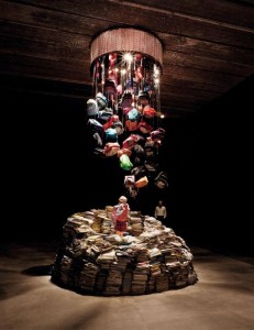
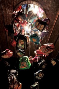
In case it’s hard to discern, yes, those are long shards of glass dangling between the backpacks. So, a sort of Cask of Amontillado-cum-Pit and the Pendulum situation, except the sociopathic killer is the Chinese education system. Right. The shards are there because the school materials are a METAPHOR, METAPHOR for LOOMING DANGER, sword of Damocles, Chicken Little, etc. The problem with this kind of METAPHOR is that it hits hard but doesn’t try for depth. What you see is what you get.
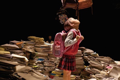
The man in the background is a nice touch, set in the back corner so that you don’t quite realize he is made of fiberglass until you get closer. He’s genuinely discomfiting. At the time I assumed he was supposed to be the little girl’s father. After some snooping around on Google (what we in the arts call “due diligence”), I found out that it’s actually a self-portrait. Li Zhanyang is also the father of a nine-year-old girl.
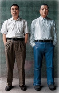 Even though I think it’s pretty weak to rely on outside information or a wall text to complete the meaning of a work of art, this detail makes the piece. It’s still a ham-fisted visual metaphor for what isn’t an especially original idea, but in a country where mental health and suicide among kids are both alarming and, for practical purposes, largely ignored, it begs the question whether subtlety or nuance are even important. The self-portrait also shifts the message from “What the hell is wrong with you?” to “What the hell is wrong with us?,” which is always much more effective, rhetorically.
It’s for this reason that I have to give this round to Li. Neither installation is going down in the history books, but at least Li’s has an immediacy to it that sits uncomfortably alongside its aesthetic value. He too doesn’t go much beyond “raising awareness,” but his installation works emotionally instead of conceptually, which is more appropriate. It’s also a far cry from what most Chinese contemporary artists are doing, which is trying at all costs to avoid being pinned to any single meaning. If people understand you, they can dismiss you. Obscurity has a premium. Make no mistake, artists know that it’s in their best interest to keep you confused, which is why Li’s work is far bolder than he’ll get credit for.
The best art is still that which is subtle, profound, and containing complexities drawn out by slow contemplation. Barring that, you might as well get a rise out of your audience.
Li Zhanyang’s “The Nightmare” will be on display at Galerie Urs Meile in Caochangdi until April 29. “Bai Yiluo: New Works” will be on display until April 16 at Pekin Fine Arts in Caochangdi. Also, just go to Caochangdi. The art is way better and you get to feel superior to the all the 798 folks. Dilettantes.
Guy Templeton is an art critic in Beijing. |Art Review Archives|


