UPDATE, 12/18, midnight: We’ve switched things up! Blog view is now the frontpage, and the first panel is the “featured posts.” The “category view” button is what you want to click if you’d like to view by our categories. The sidebars have been changed too, slightly. Much easier to consume the content this way.
You can probably disregard most of the below. /end update
(Note: there are a slew of problems that will be fixed in the coming week, everything from font stylization to sidebar box size. Please bear with us as we iron out the wrinkles.)
We decided to go big. The reason for the redesign is simple: to enable more. I want more content-creators to feel like their work is given the proper attention on the front page, and I want readers to be able to consume that content alongside aggregated content more readily and efficiently.
But we really haven’t reinvented anything, and I think you’ll find that the site isn’t as different as it seems. Let’s pop under the hood and figure this out.
There are two ways to view the new BJC: Default and Blog. Those who prefer consuming the information as before — 20 posts, one on top of the other, starting with the most recent — should click on the BLOG VIEW button in the upper right-hand corner. You’ll be taken to beijingcream.com/blog, which you should bookmark if you prefer this as your default. Please note that the URL for our RSS feed remains simply beijingcream.com.

But let’s click over to the default view and see what’s new.
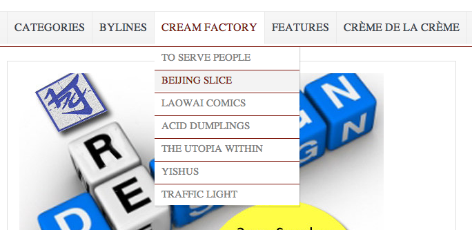
The menu bar is the first change. You can now roll your mouse over each of the first four categories to pull down more options. Creme de la Creme, as before, is BJC’s collection of original substantive work.
The next element is the Recent Posts box. The stories here are presented chronologically from left to right on the slider:
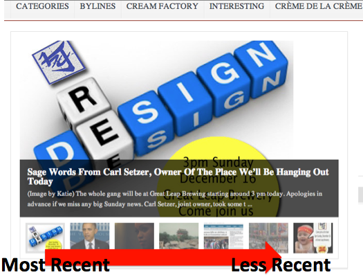
The posts that deserve further attention will be placed on the next row, “Featured Posts.” Rolling your mouse over the thumbnails pulls up the headlines:

Below that, the categories are stacked one atop the other. For those who have never known, the categories: General (most stories fall under here), BeiWatch (Beijing-specific), Wok of Art (including BJC’s two resident comics, Acid Dumplings and Laowai Comics), 5000 Years (anything related to culture, including the Outros, Chillax, and The Good Doctor’s Beijing Slice), and The East Is Read (strictly news stories, and Links posts).
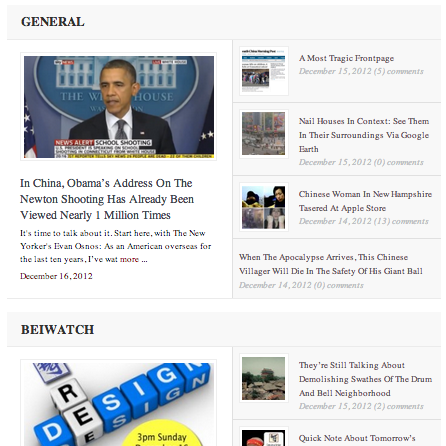
I’m excited that the new layout will enable us to post more strictly news stories, meaning you’ll now get a lot of links that would otherwise have fallen into our Monday/Wednesday/Friday links post. Please click on the “East is Read” category if you want to catch up on the latest China happening. (We’re currently working on category-specific RSS feeds.)
Also, BJC TV — which appears on each page — has been created to give proper attention to video content. We have a new video editor, Gabe, who you’ll be seeing a lot of after the new year. He will be making new, original videos that I dare call groundbreaking.
If you click on any of the categories, you pull up the Category view, which changes the sidebar from “random posts” to “recent posts” (15) and “most popular” (8). It’s just another way for you to browse and find content.
Speaking of changing sidebars: clicking on an individual post will now bring up this new one, which is awesome:
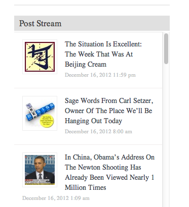
I’m probably most excited about this “Post Stream,” inspired by Gawker, which allows readers to continue perusing additional without reloading the previous page. Thumbnails and post headlines are in the stream, arranged chronologically with most recent up top.
Play around with this and please give us feedback if you see problems or have comments/questions.
We’d like to thank Fabricatorz‘s Jon Phillips and his team, including John Korkidis here in Beijing, for their professionalism and hard work on this redesign. Again, it’s not completely done — we’re striving for perfection — but it is a lot better than this:
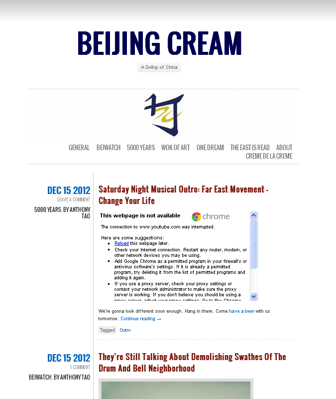
Thanks for hanging in there with us.


















Love it. Keep up the good work, guys and gals! This is EASILY the best new blog on China in recent memory.
Glad you’ve taken a page from the cadre playbook and have upgraded to a sexier, more nubile model. Good functionality, easy on the eyes—looks great.
Some of the stuff looks great but there are a lot of problems. A big one is the inclusion of lots of scripts from blocked sites like twitter, facebook, google api and vimeo. The twitter and facebook widgets should not be put on chinese sites as they block the page from fully loading for more than a minute as the page waits for the connections to time out. On the blog page this means you sit there waiting for the widget to load for a full minute before you can see the text for he first story load.
On the normal front page it looks great but it is information overload. This is common with feature creep and over design of pages. If you look at the page start from featured posts first you see a bunch of pictures with no context, then you see the story but it is split half the box is the story and half the box is the related stories, it is a little confusing. A better layout would be the story taking up the full width of the box and 80% of the height and the bottom 20% is the related stories with a small label saying related. Also the join the conversation is too much in the middle of the page, it would work better as a side bar off to the far right, you should remove the blank wordpress borders. Good to see these updates though i hope all the bugs can be worked and i look forward to seeing improvements you guys make
I’m liking it!
As marme says – the blocked-site notices can be bothersome, but who’s really still using the Internet in China without VPN?
These days, a good question. We’ll look into some alternatives nonetheless.
Me.
Besides the slow load times, I’m having trouble with the mobile version displaying text properly. The text is too big to completely fit on the screen and for some reason it isn’t allowing me to zoom out.